• Skip to primary navigation
  • Skip to content
  • Skip to primary sidebar
Graphic Design For Bloggers

Hatch Design Workshop

Graphic Design For Bloggers

  • Start Here – Topics
  • Custom Logo Design
  • My Shop
  • Contact

Website Design

The Blank Canvas: How To Create A Professional Looking Blog Cheaply

Topics: Website Design

How To Design A Blog Website

When I create a new website, I look for the most basic WordPress theme I can find. And I try to take away as much of the ‘features’ and ‘bells and whistles’ of the theme as possible. Because I know I can turn a completely blank canvas, into a great looking blog by focusing on just 4 main areas:

  1. Have a great looking logo
  2. Add sidebar graphics
  3. Have great looking blog title images
  4. And choose the right font for the text (main blog text, and headers/titles)

By focusing on these 4 areas you don’t need to spend a lot of money on a blog theme to get you started.

A big problem I had when starting my home design website (and understanding how to build/edit websites), was that when I bought a WordPress theme that had great looking features (sliders, fancy layouts, etc) – things would break on the site anytime I would try to make a simple change to the design. These themes work great out of the box – but wanting to try and change things can quickly mess things up.

1. A Great Looking Logo

Not only is having a great looking logo important because it represents who you are and what you do, but it is the first thing people will see on your blog. Since it is right at the top of the website, and it sets the style and feel for the rest of your blog.

If you have a watercolor logo for example, then you will want to have a few small watercolor elements in your sidebar, or even in the blog posts themselves. If you have a modern icon blog logo, then this can work its way again into the sidebar or blog posts – and to the overall design of the blog.
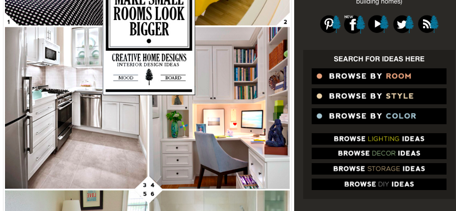
  • How To Hire A Logo Graphic Designer – Custom Logo Design And Price

2. Sidebar Graphics

Add 1 or 2 graphic into your sidebar to make a great looking blog. These graphics should match the style of your branding/logo. A graphic can go right at the top of your sidebar, or under your first widget.

Or you could use graphics to divide the content up on your sidebar. I have a hand drawn graphics branding pack that includes a number of these sidebar dividers.

Hand Drawn Sidebar Dividers

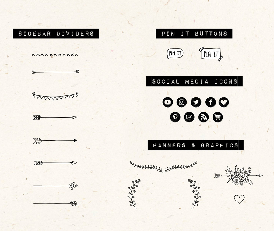
It might seem like a small thing to add just one graphic to your sidebar. But it is the small things that will add up to creating a great looking blog. You can even add a divider to your blog posts (either at the end of each post, or to divide a section) – have a look at the one I have added to the end of this section. It is the small things.

At this point, when people visit your website they will see your well designed logo and matching graphics. This alone can say a lot about who you are as a blogger and keep people interested.

Hand Sketched Divider Arrow

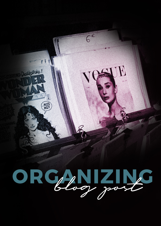
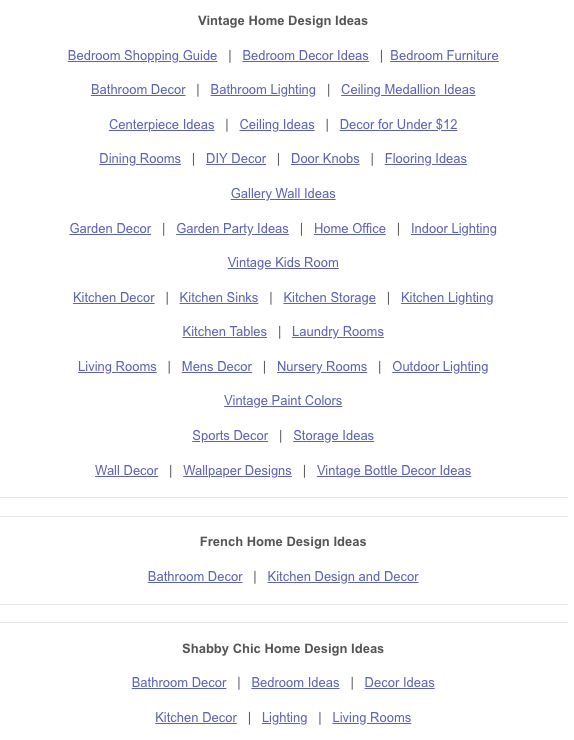
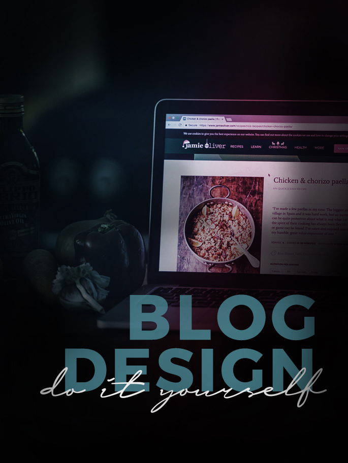
3. Blog Post Title Image

This is the image that you put at the top of your blog post – as sort of a visual introduction to your post. They are Pinnable, and on Facebook they will show this image when the whole post is shared.

If you go onto someones blog, you will see that these images take up a lot of visual space on a blog. Meaning they need to look good. And the style you use to create these images will also say a lot about the brand and personality of the blog. Using bright colors show a more vibrant dynamic blog. I use darker colors because I want to give off a more ‘designer-y’ feel. I use fonts that match what I want the website to stand for – simple and well designed.

How To Design Blog Post Images Title

Visit well designed blogs you like, and see how they create their blog post title images. Also searching for posts on Pinterest will show a lot of different styles (different layouts, colors used, font choices, etc.) to get inspiration from.

4. Small Details: What Fonts Are You Going To Use?

This is a really subtle area of the blog. But can make a big difference.

The text on your website takes up probably the most ‘visual’ space. But you don’t really pay close attention to it compared to photographs, your logo, or sidebar. So it is important to find the right font combinations to use.

Again, look at well designed blogs that you like, and see what type of fonts they use for their headers (blog post titles, sidebar headers, menu buttons). See what font size they use, is it large or small? Are their titles all in uppercase? Are they using black or a color? I like a really dark shade of grey for my main text.

Good looking, well established blogs will keep it simple. They won’t use fancy script fonts – because they are hard to read. When I was chosing what fonts to use for this website – I went and studied what other blogs were using.

Here is what I am using:

For blog post titles (the css code)

font-family: montserrat,Arial,helvetica neue,Helvetica,sans-serif;
font-size: 18px;
letter-spacing: 1px;
line-height: 1.4;
text-transform: uppercase;
font-weight: 600;
color: #000;

  • letter spacing is the amount of space between the letters
  • line height is the amount of space between each line of text
  • text transform (uppercase) makes all of the letters uppercase
  • font weight is how bold I want it
  • and color is black


For the main text of the blog post

color: #262626;
font-family: karla,sans-serif;
font-size: 14px;
line-height: 1.429;

  • notice how the font color is not completely black, it is a dark grey – which is subtle.

It might not seem like a big deal, since I just chose what most people would think are normal fonts. But have a look at the before and after (the default fonts for the Genesis WordPress theme – which can be seen everywhere, versus what I changed it to).

Blog Fonts Website Design

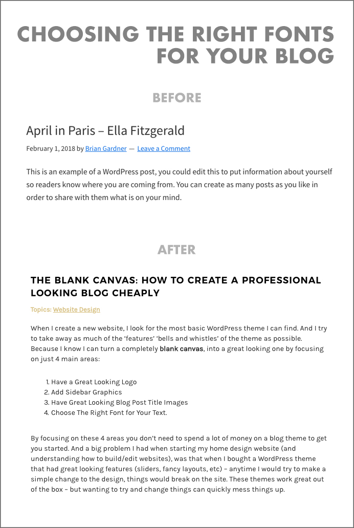
It is subtle, but when your text takes up the most amount of space on your website – it makes a big difference.

–

So focus on those 4 areas (logo, sidebar graphics, blog title images, fonts) and you can avoid using a blog theme with lots of complicated features/bells and whistles to make your website look good.

Recommended Reading:

  • How To Hire A Logo Graphic Designer – Custom Logo Design And Price
  • How To Organize and Display Blog Posts – Creating a Blog Post Menu
  • How To Learn Graphic Design – The First 3 Things To Learn for Beginners

Topics: Website Design

How To Organize and Display Blog Posts – Creating a Blog Post Menu

Topics: Website Design

Blog Design Organizing Blog Posts Layout

If your blog, like many out there, has a lot of evergreen content – then you want to find a way to make sure those blog posts don’t get buried away and forgotten.

Evergreen Content – these are posts that are useful today and will be in the future. For example: how to’s, tutorials, travel guides, recipes, tips and advice. Versus content that is just about daily life.

It is easy for these posts to get buried away when you are publishing a lot. And most blogs are designed so a viewer has to scroll past the full blog post or excerpt to see what other posts are on the website.

Here are a few ways to organize and display your posts, and make sure they are not forgotten.

The way you choose to display your posts will come down to A) how many posts you have and B) what ways would your viewers want to filter your blog posts (for example this will be different for food blogs with recipes, than a travel blog with guides).

1. The List

This is the most basic and easy one to set up. Today on this website (November 2018), I created a list of my blog posts on the page Start Here – Topics. It is organized by topics, and in the order a viewer would go about starting and building their blog/business. Getting Started (blog posts on how to name your business, setting up a website, etc), Logo Design (blog posts on how to get a good logo design, using a premade logo, etc), Website Design, Social Media Marketing, etc.

It only took me a few minutes to create it. And is an easy way for people to quickly go through the different posts I have on the website.

If you have a travel blog – you could list topics by location, or by type of traveling (budget, train, boat) – or create more than one list if you think each list would help your readers.

If you had a food blog – you could list topics by breakfast, lunch or dinner. Or by styles of food (Asian, Italian, etc). Or by types of food (meals, baking, snacks, drinks). Or have multiple lists.

2. The Big List

If you have a lot of posts, you could create a page for each big topic – and list out your blog posts. Then in your sidebar you can link to each of these pages.

This is what I did with my home design website Home Tree Atlas.

I thought about how people would be searching for home design ideas:

  • Some people would be searching based on the room – bedroom, basement, kitchen, etc.
  • Some people would be searching based on style – vintage, modern, minimalist, etc.

For topics that I had a lot of posts (bedroom ideas, kitchen ideas), I create a page for each one. For posts that I did not have a lot of posts for (vintage style, modern style, rustic style), I grouped them together on one page under different headings.

Menu Options

The sidebar links to different topic pages I created for easy access

–

Rooms

Selecting ‘Browse by Rooms’ in the sidebar takes you to this sub menu to select which room

–

Bedroom Ideas

If you press on ‘Bedrooms’, you then go to a page with a list of all of my bedroom posts

–

Blog Sidebar Design

Clicking on ‘Browse by Styles’ in the sidebar takes you to this one page with all of the different styles. Since I don’t have many posts for each one, I created just one page for this.

–

3. Adding Pictures

You can get fancy with how you organize and show your posts by adding a (small) picture.

Here are some examples of it being. First by NeedWant:

Blog Page Design

–

And here by Smart Passive Income:

Blog Posts Layout

–

The biggest challenge with trying to do this, if you are just starting out, is the coding required to make it look like one of those examples.

4. Blog Post Filtering Plugin

There are WordPress plugins that will automatically sort and show your posts when someone clicks on a topic.

You can see it in action on the Resonate Project website. By clicking on one of the topics, the posts will organize themselves and only show posts about that topic – instantly on the same page.

Blog Post Filter Grid

The plugin being used on the Resonate Project website is called Post Grid.

–

Another example of posts being filtered live, is on the Pinch of Yum‘s recipe page:

Blog Post Filtering

And the plugin being used is called FacetWP.

Post Grid is much cheaper at $19. And FacetWP is $99. But if you are planning on having a lot of blog posts, I would recommend looking at what Pinch of Yum has on their website with FacetWP. I have only used Post Grid, but only for a small number of posts.

5. A Few Other Ways

Tim Ferriss from the 4 Hour Work Week blog keeps a list of topics in the sidebar of his blog – which includes a count of how many posts are in each topic.

Blog Topics Lists

–

And when you click on each topic, you get taken to a page with all of the posts (with a small picture).

Blog Post Layout

–

Tim use to have a tabs menu on his sidebar, which is gone now. It was something that looked a bit like this:

Sidebar Menu

And they had titles along the lines of ‘Popular Now’, ‘Most Popular’, ‘Tims Favorites’ ‘Most Useful’.

And when you clicked on the tabs, it would show you a list of 4-5 posts for each section. Which was a great and fast way to see what the blog was about and to access the best posts.

Recommended Reading:

  • Quick Instagram Tips – A List of Best Things to Do When Posting

Topics: Website Design

Primary Sidebar

About

Hatch Design Workshop is the place for bloggers to get graphic design tips about logos, website design, social media graphics, and much more. Est. June 2018.

Start Here – Blog Topics

My Shop

Topics

start your blog / website

blog website design

logo design

social media design

graphic design tips

youtube

© 2025 · Hatch Design Workshop