• Skip to primary navigation
  • Skip to content
  • Skip to primary sidebar
Graphic Design For Bloggers

Hatch Design Workshop

Graphic Design For Bloggers

  • Start Here – Topics
  • Custom Logo Design
  • My Shop
  • Contact

Graphic Design Tips

How To Learn Graphic Design – The First 3 Things To Learn for Beginners

Topics: Graphic Design Tips

Graphic Design For Beginners

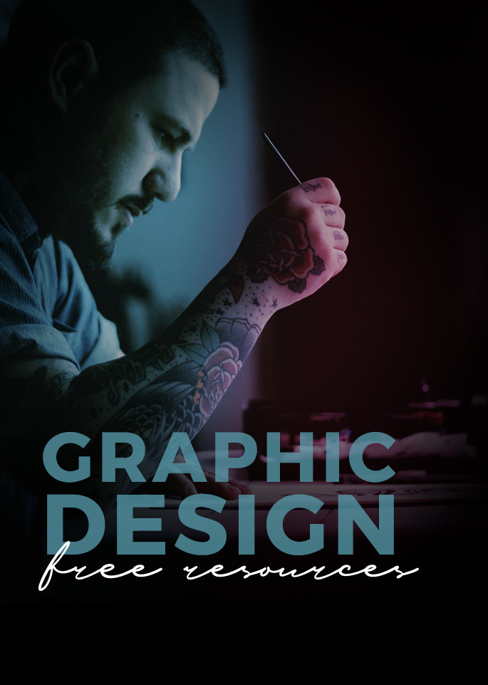
This is just a quick mini online course on the 3 areas to focus when you want to learn graphic design (fonts, layout, and colors). I do not go over any technical parts of using any programs or tools (Illustrator, Photoshop, Canvas). As this info can be applied to any program.

In this post I am going to get you to hack the learning curve of graphic design. I want you to learn the 3 most important things first, as these areas will get you looking close to a professional graphic designer on day 1. If you have ever read The 4 Hour Work Week – then this is the the 80/20 of graphic design. The most important 3 things to learn that will get you 80% of the way to becoming a great graphic designer.

How To Become a Graphic Designer Day 1 – Create Logos: When it comes to practicing the basics of graphic design, I would recommend creating logo designs.

First by creating a simple text based logo with no graphics. Name: Hatch Kitchen, Subtitle: Food Blog. From this exercise alone, you will learn how to use fonts, find them, install them, pair them. Search on Pinterest for “Typography Logos” and you will see how text alone can be used in so many different ways, and how it is a big part of graphic design.

Then you can move onto learning how to add in a graphic to your logo designs. And how to arrange and combine text and graphics together.

–

So here are the 3 main areas to focus on when learning graphic design.

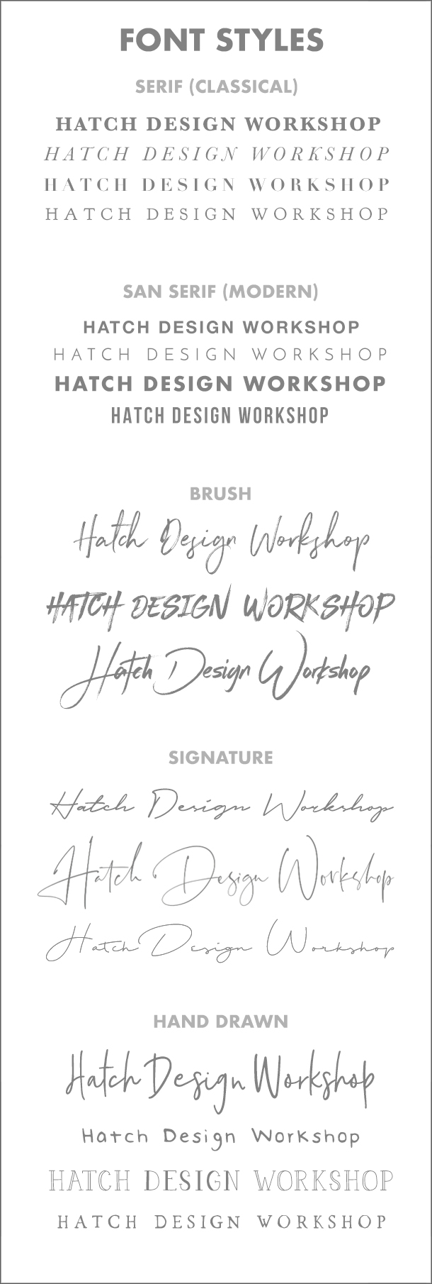
1. Typography (Fonts): The One Thing That Makes Up 80-90% of All Graphic Design

Look at logos, posters, business cards, or websites. How much of it is text? Typography makes up 80-90% of a lot of graphic design. This means if you learn how to use fonts well right away, you are quickly on your way to becoming a great graphic designer.

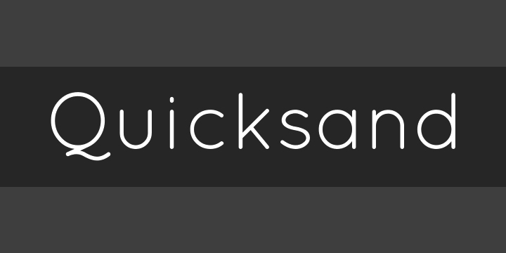
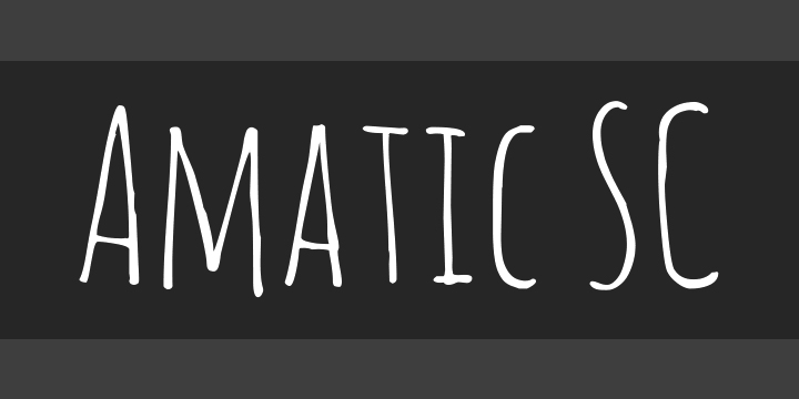
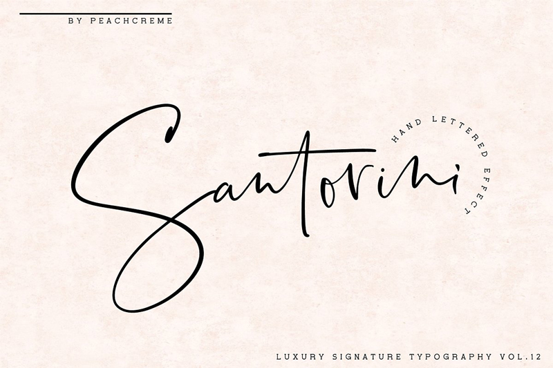
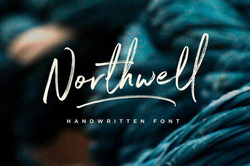
What you use for a font really says a lot about your design. When creating your design, whether it is for a logo or website, what is it that you want to say? Are you going to use a more classical font, clean and modern, a more stylistic brush font, a luxury cursive signature font, or a hand drawn one:

Graphic Design For Beginners Font Styles Typographic

–

Learn How To Use Fonts in 1 Day

The fastest way to learn how to use fonts like a professional designer, is to buy logo template packs. These are logo templates that great designers have made and sell for people to use in their own work. These packs include a list of usually free fonts they have used.

These designers have done the hard work of finding the best looking free fonts available, paired them together, and created well designed layouts. Buy these packs, download the free fonts and rearrange the text and graphics, or add in other graphics, to create your own designs.

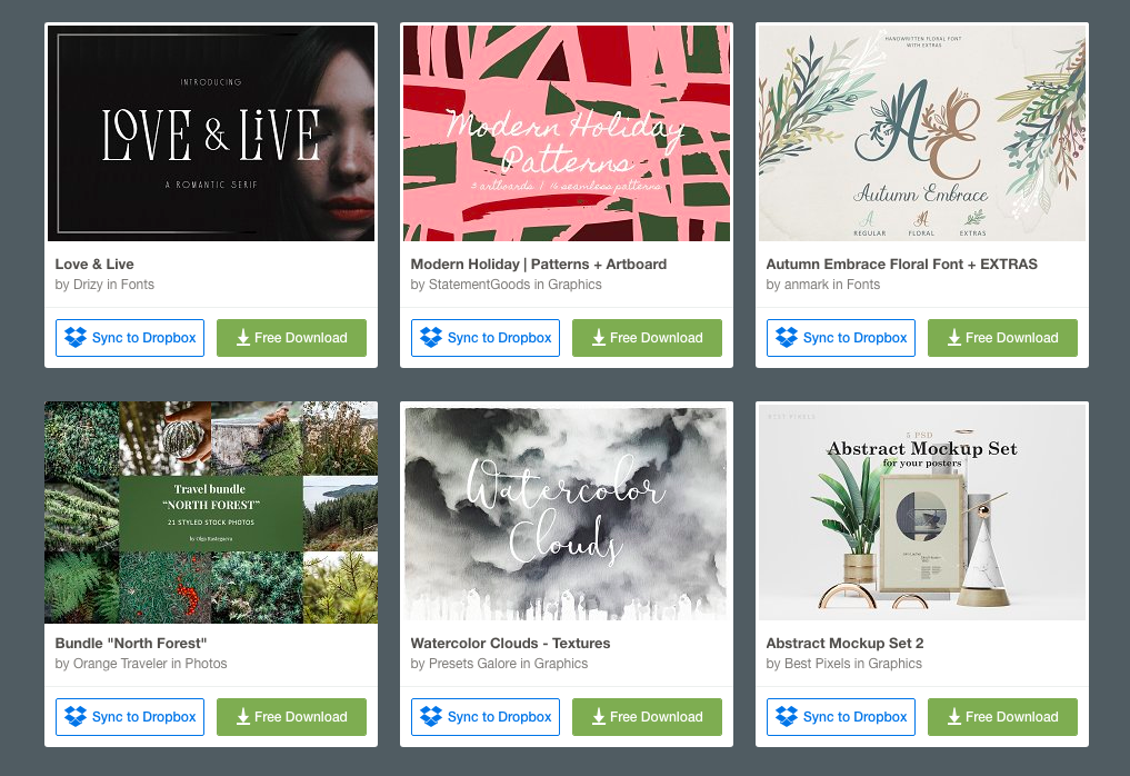
Here are a few logo template packs to check out that use free fonts:

Hand Drawn Logo Templates

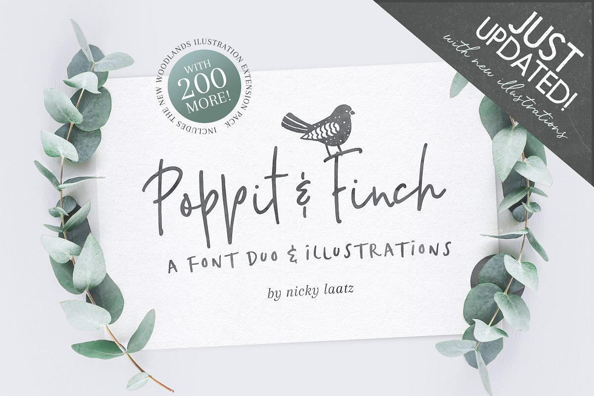
Hand Drawn Logo Templates by Maggie Molly

–

Hand Drawn Logo Templates Illustrations

Hand Drawn Logo Templates by Hatch Design Workshop

–

Vintage Logo Templates Graphics

Vintage Logo Templates by OpusNigrum

–

Quick Tips for using Fonts:

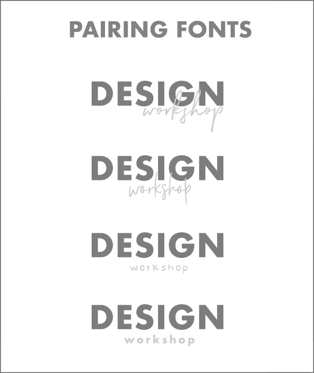
  • Understand how to ‘pair fonts’. This is putting two or more fonts together, without them clashing with each other.  Say you are creating a logo and need to have a name and subtitle – use a clean straight forward font with a more stylistic one to balance them out:

Font Pairings Combinations

  • Use free fonts to get started, but try and upgrade quickly to the paid $16-20++ fonts as they look a lot more professional – Free Resources – Graphic Design For Beginners
  • Play around with letter spacing. This is the amount of space between each letter. Making them wider apart can make the text feel more luxurious at times, and also help you fit text in different places in the design
  • Go to Pinterest and look at really great logo designs, and study them and figure out what makes them great. See what type of fonts they used, how did they combine fonts, how did they arrange the different texts and graphics.

2. Layout: Organizing Your Text and Graphics

Place your focus on learning typography, as that alone will shoot your graphic design skills straight up right away. Just using a premium font (Creative Market) alone will have your designs looking close to a professional on day 1.

The next area to focus on would be layout. This means how you arrange your text and graphics together.

  • Understand hierarchy. This means putting emphasis on what you want the main message you want to be, and don’t let the other parts compete for attention. So if you have a logo with a name and a subtitle (“food blogger”), based on hierarchy you want your name to be the biggest and boldest, while the subtitle is much smaller and under the main name. See how “Design” is much bigger and bolder than “Workshop” in the examples above for font pairing.
  • Layout is a tough one to explain. The best thing to do again, is to head over to Pinterest and study great designs. When you look at logos for example, you have ones that put the graphic next to the text, or the graphic is centered above the text. You could even put the graphic in between words. You can arch text over or under. You can have text go in a circle around a graphic.

Graphic Design For Beginners Layout

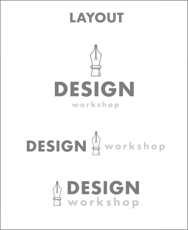
So again, go to Pinterest and study how designers are laying out their designs. And keep a mental note of all the different ways it is possible. If you buy a logo pack to practice and understand fonts from what I wrote above, the designers who created the packs have already created ready made layouts that you can use – and remix to create your own designs.

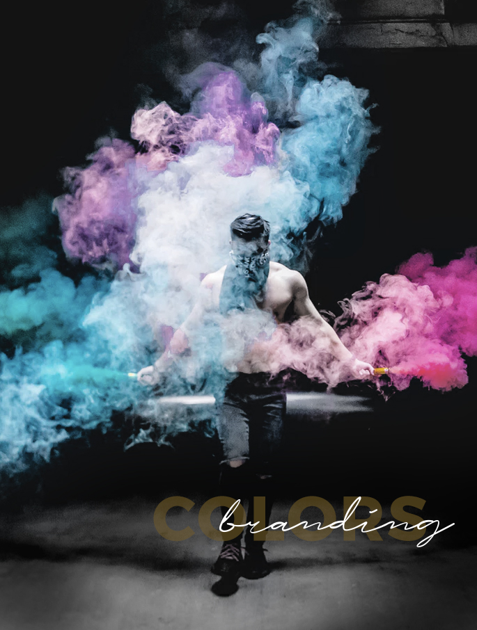
3. Colors: If You Need Them and How To Combine Them

When it comes to using color, my personal preference is to limit colors to using 1 (other than black or grey), or use none at all. Stick with the basics in the beginning. Go with black and white. Then try different shades of grey. Then mix black (or dark grey) with one color. For a beginner limit the colors you use to 1 (other than black and greys).

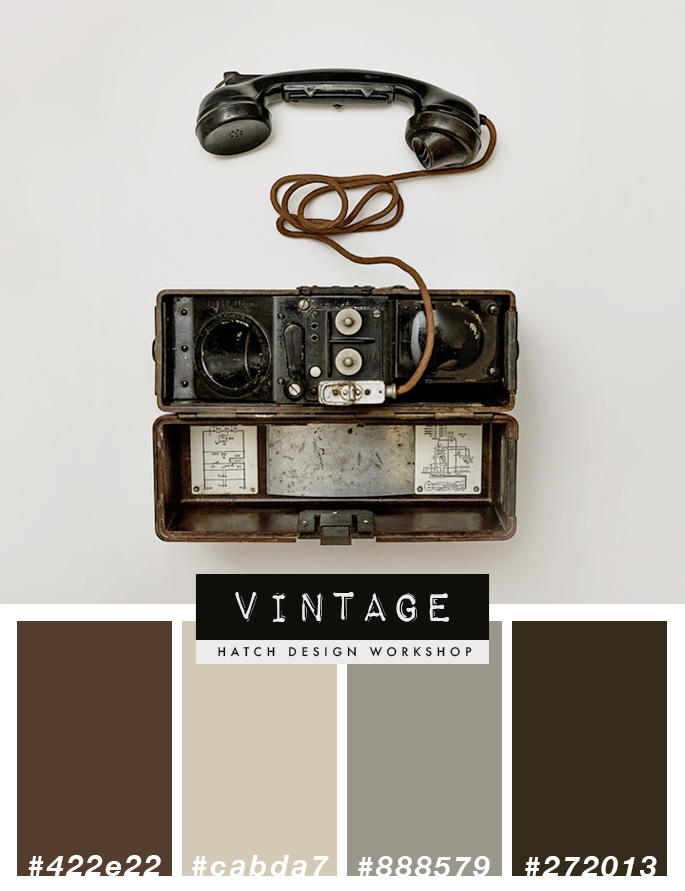
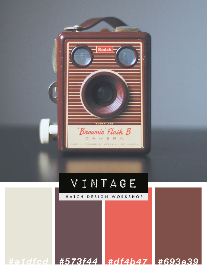
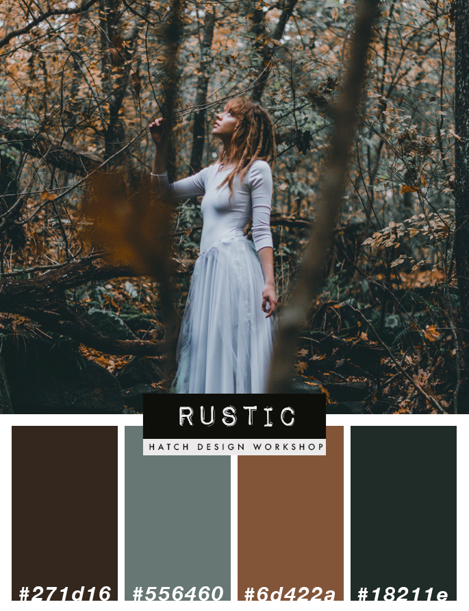
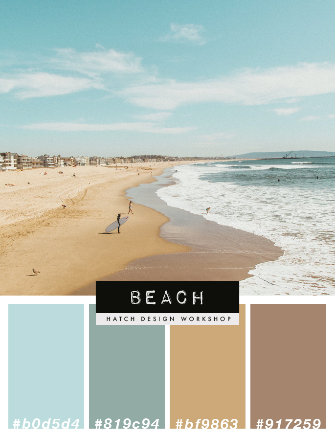
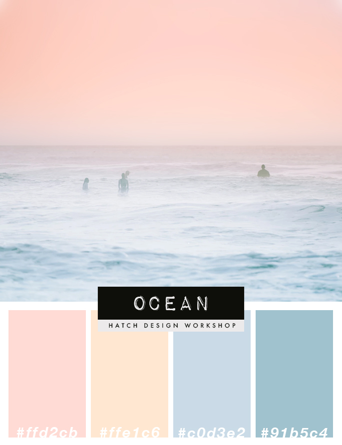
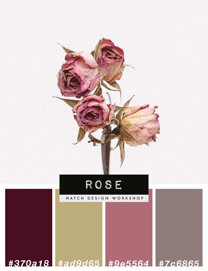
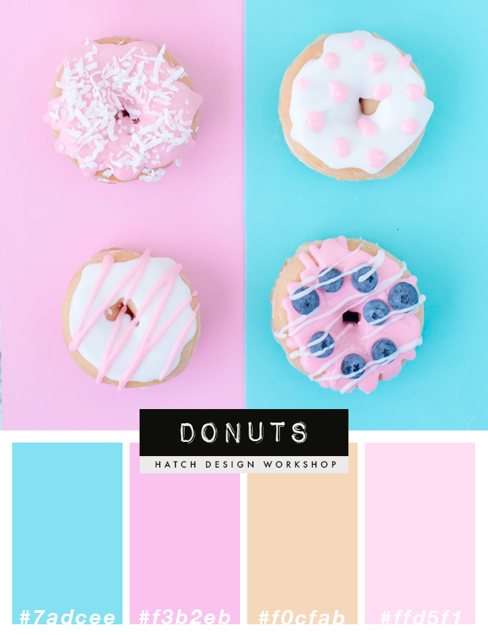
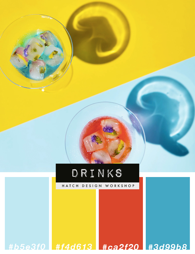
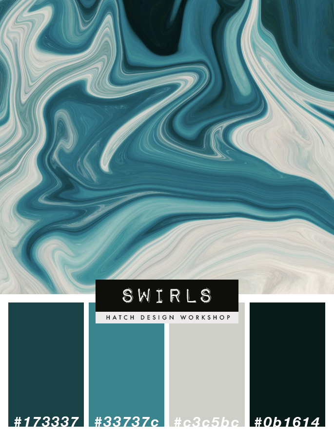
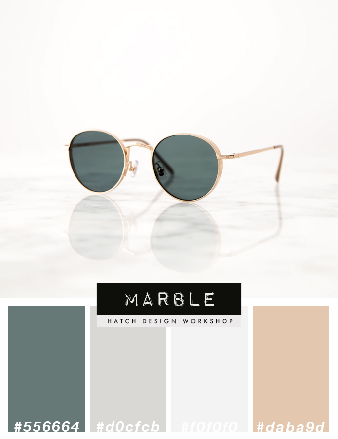
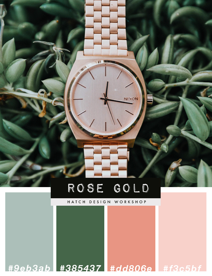
If you want to combine 2 colors or more, the best and fastest way to get this looking good is to go onto Google Images – and search “_______ color palette”. In the blank space you can put in something specific that you want to see – vintage color palette, pastel color palette, neon color palette, pinks color palette.

Color Palettes

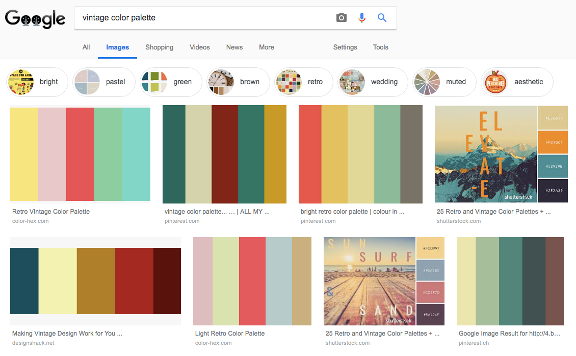
The search results will show images that people have put together that have color combinations that work well together. You can then copy these images into your work and use the eye dropper tool to get the same exact color to use in your work.

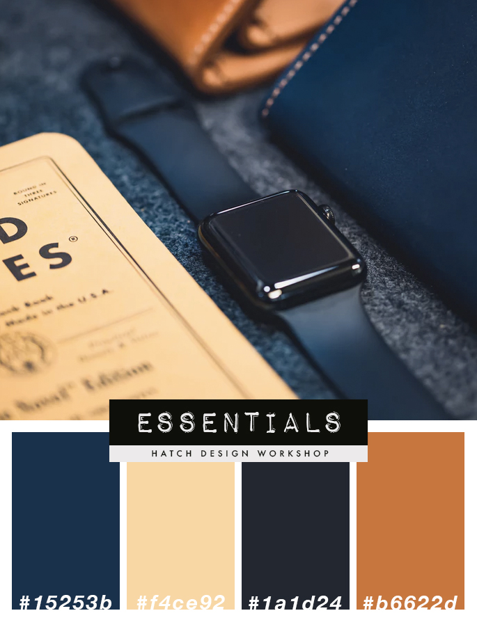
You can find color palette images I have created with the color codes here: How To Know Which Colors Work Best For Your Brand

So use ready made color palettes to get the right combination of colors, and you will be looking like a profession designer.

–

Those are the 3 main areas to focus on when learning graphic design 1) typography/fonts (the most important) 2) layout and 3) colors. Pinterest is the best tool for looking at well designed pieces. Study and figure out what makes them look great. And focus on making logo designs when you are a beginner – so you can understand and practice the basics of graphic design..

Recommended Reading:

  • What Makes a Good Logo Design
  • Free Resources – Graphic Design For Beginners

Topics: Graphic Design Tips

Free Tools and Resources – Graphic Design For Beginners

Topics: Graphic Design Tips

Graphic Design Free Resources

If you are just starting out and want to learn graphic design, then these free resources will help you get started. It is good to start with free resources and save money, and then move onto more premium and paid tools once you have learned how to use the different graphic design programs.

1. For Photographs

Unsplash – This is the resource I probably use the most even today. And it is completely free to use. It is a stock website, with great looking photographs. And you can use any of the images for pretty much anything you want. To create blog post images, to create product preview images, for social media posts. The only thing you cannot do is sell them, or include them inside products you sell (but you can create a list of links to different images on Unsplash for buyers to use).

Free Stock Image Food Blog

Examples of photos on Unsplash that are free to use

2. For Fonts

Behance: So you have Unsplash for photographs, and now when it comes to fonts – I would check out Behance. Behance is a portfolio website for designers, and a lot of designers have free fonts that you can use. Use the search in Behance to look for “Free Fonts”. You do have to look to see if they are free to use for both personal and commercial. Some let you use them for personal work, but then require you to pay for commercial use.

Here are some great fonts to get started that are free for both personal and commercial usage:

Aqua Grotesque Typeface

Aqua Grotesque Font

–

Puzzled Script Font

Puzzled Script Font

–

Font Squirrel: This is where I would go to a lot when I started doing graphic design. This website has a lot of fonts for free commercial use. Not all are the best looking – but it is a good place to get started.

Here are a few that I have used often:

Montserrat

Montserrat Font Free Font

–

Quicksand

Quicksand Font Free Font

–

Amatic

Amatic Font Free Font

–

Creative Market: If a friend were to ask me what would be the best way to learn how to use fonts, I would say go to Creative Market and buy logo template packs. Yes, you do have to buy the logo packs (which includes graphics – for $16-25++), but 95% of these packs use free to use fonts for the logo designs (read the product descriptions). And the (great) designers have paired them with other free fonts – creating a well designed layout.

So not only do you get a list of great looking free fonts, but you will know what fonts pair well together.

Here are some examples:

My own Hand Drawn Logo Templates

Hand Drawn Logo Templates

–

Vintage Logo Templates Bundle

–

3. For Graphics (Icons, Mockups, Backgrounds, etc)

Graphic Burger: This website has a lot of free graphics for commercial use. They have icons, and backgrounds. But what I use to go there for, were for their mockups.

For example, you designed a graphic and want to have a photo with your graphic on a t-shirt – then Graphic Burger has a number of t-shirt mockups that are free to download.

Free T-Shirt Mockup Design

Free T shirt Mockup Design

–

You can find all sorts of other mockups from business cards, bottles, to yoga pants and iPhones.

Free Mockup Designs

–

Creative Market Free Goods: If you create a free account with Creative Market, you are able to download their free weekly goods. Each week they have 6 different free to download products that you can use.

Free Graphic Designs Fonts Illustrations Download

–

Taking the Next Step

Once you have practiced and created graphics with the free resources, the next step is to upgrade to paid tools/resources. Because the paid ones let you do more, and tend to be better designed.

The good news is that today there are so many designers creating graphics and resources that are for sale. This means that it is cheaper than ever to buy them. Before, the only fonts that were available would cost $200-300++. Today you can get world class fonts for $17-$22.

And Creative Market is really the only place I go today to get any fonts, illustrations, or mockups that I need.

Here are some paid fonts that I use all of the time:

Santorini Signature Font ($17)

Santorini Luxury Signature Font

–

Northwell Brush Font ($16)

Northwell Brush Font

–

Poppit Finch Hand Drawn Font ($18)

Poppit And Finch Hand Drawn Font

–

Recommended Reading:

  • How To Learn Graphic Design – The First 3 Things To Learn for Beginners
  • What Makes A Good Logo Design


Topics: Graphic Design Tips

How To Know Which Colors Work Best For Your Brand

Topics: Graphic Design Tips

Branding Colors For A Blog

Having a color palette for your brand does 2 things. First it helps you create a consistent look across all of your materials, whether that be your logo, website/blog design, social media, marketing materials, packaging, Youtube videos, and anything else you create relating to your business.

Second, it helps your viewers/buyers/audience know right away what sort of business or blog you are.

Imagine going onto someones blog, you can tell straight away the general vibe and feeling of the brand by the colors they use.

  • If they have bright colors, then you know it would be more of an informal, playful business
  • If they have dark colors such as rose red and royal green, then they are more luxurious

So it is quite important to have a solid color palette that represents who you are as a brand to your readers/buyers/audience.

In this post, I will show you HOW TO CHOOSE COLORS that work well together and make up a themed collection.

But first, let’s have a look at different ready to use color palettes.

Vintage Color Palettes

Brown Tan Vintage Color Palette Vintage Retro Color Palette Theme

Rustic Color Palette Theme

Rustic Color Palette Scheme

Ocean Color Palette Scheme

Beach Ocean Color Palette Scheme

Feminine Color Palette Schemes

Ocean Pink Color Palette Scheme Pink Dark Purple Color Palette Scheme Feminine

Bright and Colorful Color Palettes

Colorful Bright Pink And Blue Color Palette Feminine Summer Colorful Yellow Blue Color Palette

Luxury Color Palettes

Royal Dark Green Teal Light Grey Color Palette Scheme Luxury Marble Color Palette Light Grey Scheme Luxury Feminine Rose Gold Color Palette Scheme Pink And Green Luxury Masculine Navy Blue Brown Tan Color Palette Scheme

Figuring Out Which Color Palette Works For Your Brand

You will need to think about what sort of image, what sort of tone and voice that you want to give to your readers.

Visit websites of brands that have a similar vibe and tone that you want to achieve and see what type of colors they are using.

Start asking yourself questions, such as “what is the tone/style that I want to create for my blog or business?”.

  • Is it serious? Then you would want to avoid a bright color palette
  • Is it luxurious? Then you would want deeper colors – such as rose, navy blue, royal green
  • Are you starting a travel blog focused on beaches? Then you could go with a beach styled color palette such as different shades of blues or greens, along with light shades of brown (for sand)
  • Are you creating a bakery food blog or business, then would a pastel based color palette work best?

Think about the tone of the brand that you are creating, and picture what sort of colors associate with that. You can even search Google Images or Pinterest for general images based on a theme, and see what sort of colors pop up.

  • A vintage tone: shades of brown, yellow, tan, sepia, black and white
  • A more feminine tone: blush pink, rose gold, mint, baby blue
  • A rustic tone: fall colors such as dark brown, dark orange, and greens

Selecting Your Colors

Once you know what sort of color palette you want for your brand, then the next step is to find the specific color palette.

The easiest way to find a good looking color palette is to search for one, either on Google images or Pinterest. Use search terms as “ocean color palette” if you are looking for colors for your travel blog or travel business, or “rustic color palette”. Or you can search for specific colors “pink and grey color palette”, “rose color palette”.

If you are planning on working with a designer to create your logo or website – choose a good designer, and let them make the color decisions. You can make general suggestions: “I am going for a vintage look” or “it is luxurious”. As a designer will know best when it comes to what works well together.

Above, I have created a number of themed color palette collections that include the hex number so you can easily use them for your logo and branding, website design, or marketing materials. These color palettes are designed so that the individual colors work well together as a group.

Recommended Reading:

  • What Makes a Good Logo Design
  • Why Premade Logos Are Great For Beginner Bloggers

Topics: Graphic Design Tips

Primary Sidebar

About

Hatch Design Workshop is the place for bloggers to get graphic design tips about logos, website design, social media graphics, and much more. Est. June 2018.

Start Here – Blog Topics

My Shop

Topics

start your blog / website

blog website design

logo design

social media design

graphic design tips

youtube

© 2025 · Hatch Design Workshop